May 4, 2026
Art is a profound expression of the soul, a visual narrative capturing fleeting emotions and complex concepts. Whether it is a classical oil painting passed down through generations, vibrant modern photography, or a contemporary digital print, the artwork is only part of the aesthetic equation. The presentation fundamentally alters how it is perceived by the viewer. Framing serves as a vital bridge between the creator's original vision and the room it ultimately inhabits.
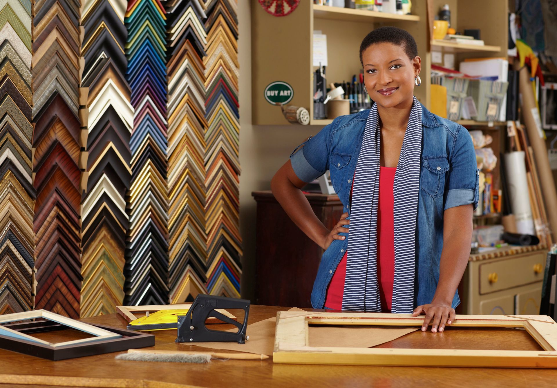
Walking into a reliable custom frame shop, you are immediately met with an overwhelming array of choices, from ornate wood moldings to sleek gallery profiles. The secret to safely navigating this sea of options lies in understanding three core design pillars: color, texture, and finish. By thoughtfully balancing these specific elements, you can elevate a simple picture into a striking focal point that perfectly complements your cherished art collection.
Mastering the Palette: Selecting the Right Color
Color is often the very first characteristic we notice, making it an incredibly powerful tool in the realm of frame design. The primary goal of a frame's color is to support and elevate the artwork without overpowering its inherent beauty. A well-chosen hue draws the eye inward, highlighting subtle undertones, while a clashing color aggressively distracts the viewer from the artist's original intent.
You must intentionally choose whether you want to complement or contrast with the artwork. Complementary colors gently echo the dominant tones found in the art, creating a highly harmonious presentation. Contrasting frames, on the other hand, provide a bold boundary that makes the artwork vividly pop against its surroundings. A professional at a custom frame shop can help you test various samples against your art.
Matting also plays a significantly crucial role in the broader color conversation of your framing project. A neutral mat provides essential breathing room, allowing the art to comfortably stand independently. If you create your own artwork, you are in excellent company; according to AYTM, 38% of respondents surveyed reported that they participate in arts and crafts hobbies. Displaying these projects with complementary framing colors ensures your work gets the spotlight.
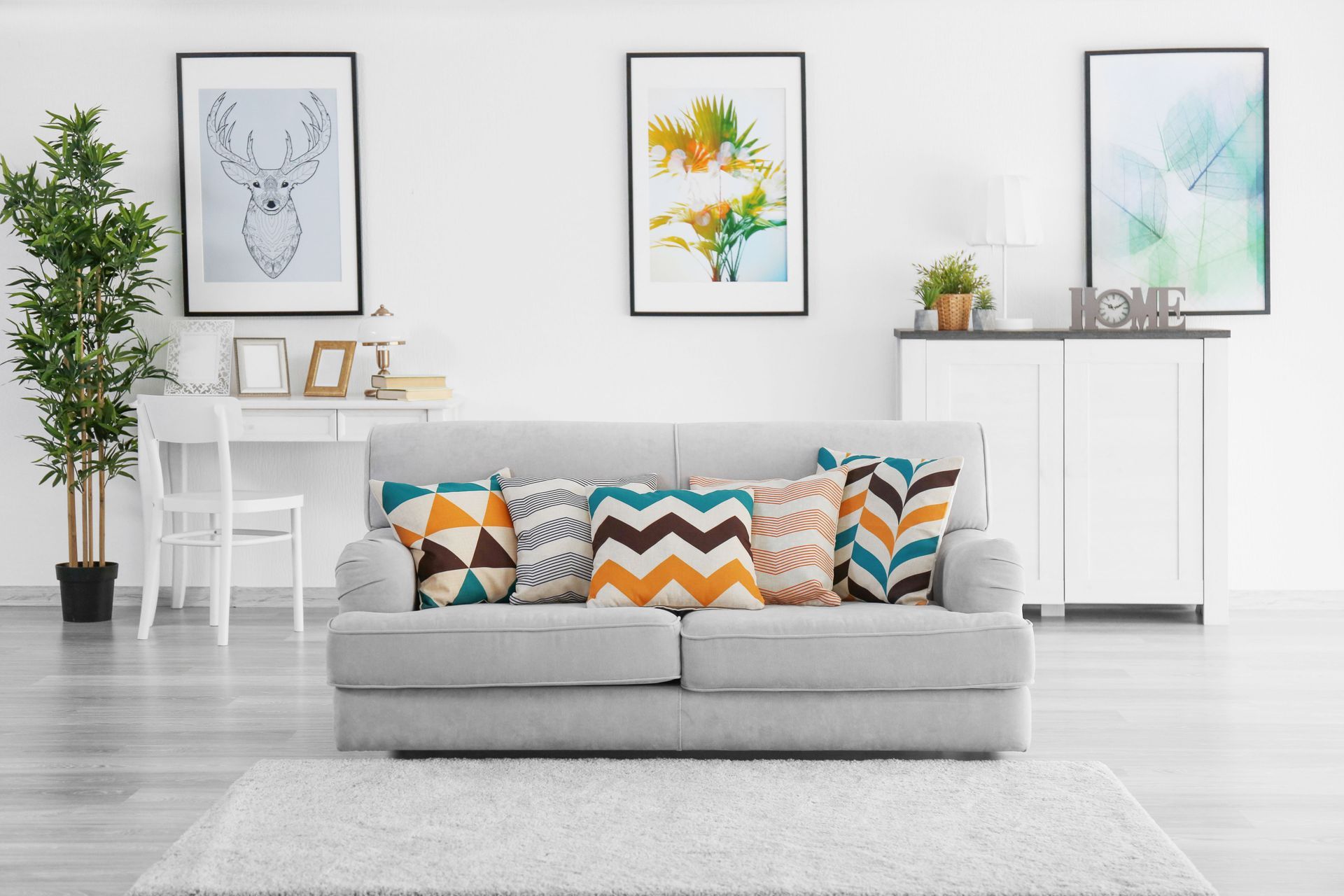
Ultimately, the chosen frame color must also be carefully considered in the specific room where the artwork will eventually reside. While the frame should primarily serve the artwork, it acts as a transitional design element in your home's broader decor. Aim for a beautifully balanced hue that respects the artwork first while gracefully offering a subtle nod to your interior palette.
Embracing the Tactile: Incorporating the Right Texture
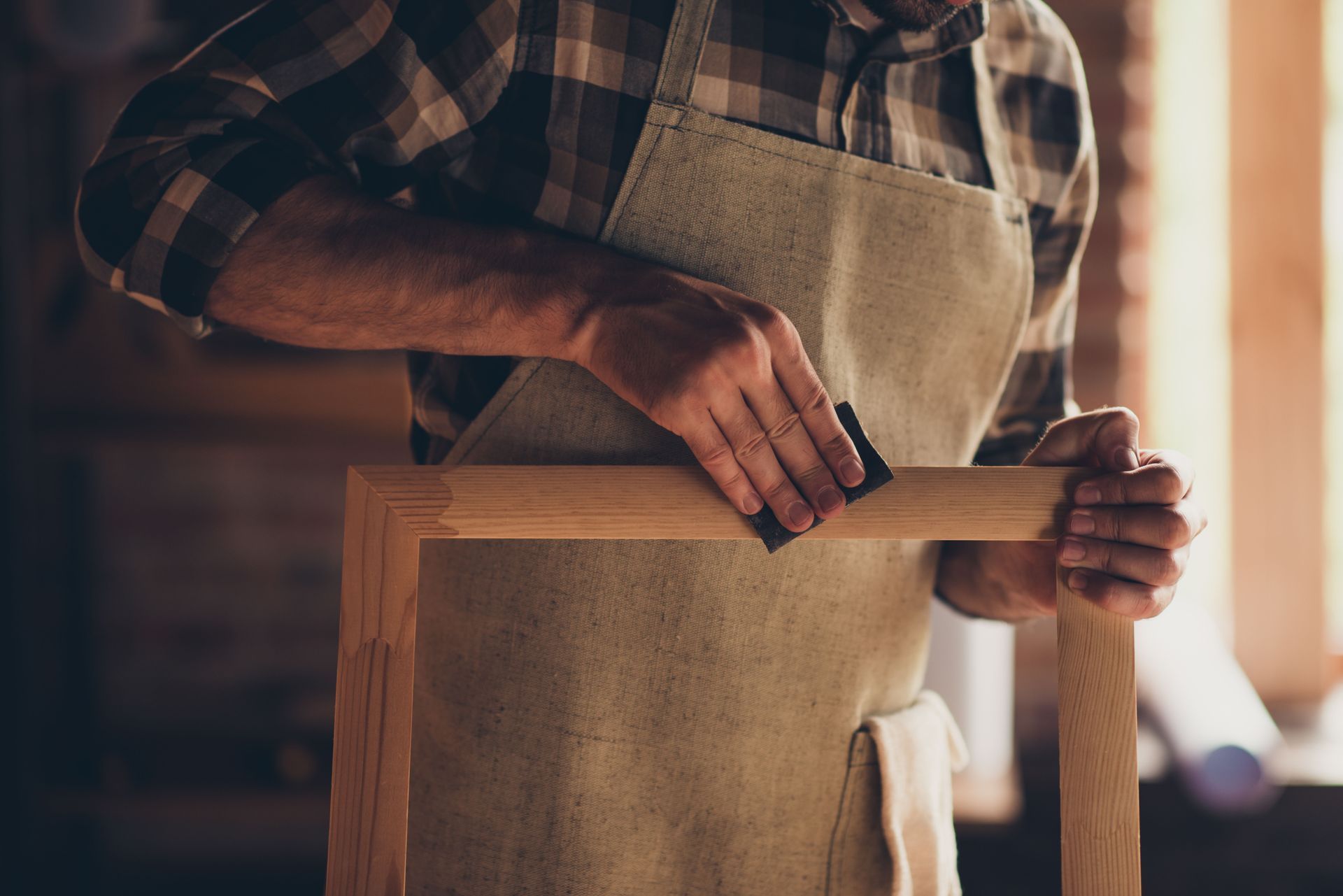
Texture introduces a fascinating tactile dimension to visual art, adding profound depth and unique character to the overall presentation. Unlike vibrant color, texture quietly invites a much closer look, revealing intricate physical details that enhance the viewing experience. The physical surface of the frame should deeply resonate with both the medium and the specific style of the artwork it encloses.
For deeply organic and natural artwork, such as sweeping landscapes or delicate botanical sketches, frames boasting heavy wood grain or rustic textures are often ideal. These beautiful natural imperfections seamlessly mirror the earthly subjects depicted. Conversely, sleek, smooth textures are better suited for contemporary architectural photography or abstract geometry. Visiting a custom frame shop allows you to physically touch these varied materials.
The specific texture of the art medium itself must also be carefully weighed during the selection process. A thick, impasto oil painting natively possesses its own heavy texture, which can be elegantly balanced by a smoother frame to avoid visual clutter. Alternatively, a completely flat watercolor might vastly benefit from a frame featuring a subtle texture to introduce physical depth.
Do not hastily overlook the texture of the accompanying matting, either, as it plays a significant supporting role. Mats are readily available in varied tactile finishes, ranging from perfectly smooth cotton to coarse linen, and even rich suede. By thoughtfully layering these distinctly different tactile elements, you create a highly sophisticated and deeply engaging display.
Refining the Appearance: Choosing the Right Finish
The finish of a frame directly dictates how it interacts with ambient light, acting as the final polish that ties the design together. Finishes range widely from highly reflective, high-gloss lacquers to completely flat, light-absorbing mattes. This specific characteristic strongly determines the frame's overall level of formality and its commanding presence within a room.
Glossy finishes are intensely reflective and inherently modern, purposefully drawing immediate attention to the piece. They are exceptionally effective for framing highly vibrant contemporary art and high-contrast photography. However, a high gloss finish requires careful lighting placement to prevent distracting glares. When consulting with a custom frame shop, it is essential to discuss exactly where the piece will hang.
Matte and satin finishes consistently offer a much softer, highly subdued, and remarkably sophisticated elegance. They purposely absorb ambient light rather than aggressively reflecting it, allowing the artwork itself to seamlessly take center stage. These highly versatile, understated finishes are remarkably timeless, making them perfectly suitable for everything from vintage family portraits to incredibly delicate charcoal sketches.
Distressed or purposely antiqued finishes provide a comforting sense of history and undeniable charm. Specialized techniques strategically add a rich patina that perfectly complements historical documents or vintage geographical maps. These specific finishes softly suggest profound longevity and deep heritage. The right antique finish ensures the frame feels like a highly natural extension of the art.
Balancing the Elements: Achieving the Right Harmony
Designing the perfect frame requires successfully harmonizing color, texture, and finish into one highly cohesive presentation. No single element should ever shout louder than the others; instead, they must constantly work together in a perfectly balanced visual symphony. When these three foundational pillars align flawlessly, the frame becomes practically invisible in its steadfast support, seamlessly elevating the artwork.
The balancing process correctly begins by accurately identifying the primary visual attribute of the artwork you wish to highlight. If the piece is widely celebrated for bold colors, wisely choose a subtle texture and a flat matte finish. For a stark, monochromatic sketch, a heavily textured frame might provide necessary visual interest. A skilled designer at a custom frame shop can expertly guide you.
Proportion and physical scale also factor heavily into achieving this essential visual harmony. A very delicate, light pastel watercolor would be quickly overwhelmed by a massive, heavily textured, glossy black frame. Similarly, a monumental abstract painting would effortlessly swallow a thin molding. The physical weight of the frame must remain proportional to the visual weight of the art.
You must carefully consider the broader environmental harmony of the final installation space. The beautifully framed artwork will ultimately live in a highly specific room, constantly interacting with surrounding furniture, natural lighting, and wall colors. By carefully adjusting the subtle dials of texture, color, and finish, you confidently ensure the piece feels perfectly at home in your space.
The incredible journey of framing your art is a deeply personal, highly rewarding, and exceptionally creative endeavor. By truly understanding the distinct and vital roles that color, texture, and finish play, you empower yourself to make brilliant design choices that elevate your entire collection. It is not merely about physical protection; it is about deeply honoring the human creative spirit and giving it a proud platform.
Whether you are carefully preserving a multi-generational family heirloom or simply showcasing your latest weekend painting project, thoughtful framing transforms the completely ordinary into the extraordinary. Partnering with a highly reputable custom frame shop ensures you constantly have the professional expertise needed to bring your vision to life. Follow your aesthetic instincts, and proudly watch as your art reaches its fullest potential. Bring your artwork to Grand Frame Inc, and let our experts help you balance the ideal color, texture, and finish for your piece. Stop by our
custom frame shop today to start designing a truly extraordinary display.